
Kyle Wagner -
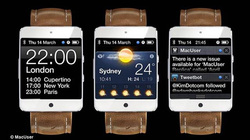
We’ve been hearing about a mythical Apple “iWatch” for a while now, to varying degrees of credibility, but this one from the April issue of MacUser magazine is probably the prettiest — and most plausibly Apple — interpretation we’ve seen.
The design was cooked up by designer Martin Hajek — who’s done some spot-on renders for Gizmodo in the past — in close collaboration with the editors of MacUser. The goal was to make it something that they could realistically see themselves buying from an Apple Store, on a hunch that Apple would keep the design as “classic” as possible. The result is something far less visually offensive than some of the other concepts that have made the rounds.

 RSS Feed
